The COVID-19 pandemic has amplified the need for websites and eCommerce. As a result, online shopping has become more of a demand and business owners can’t ignore it. It is time to get onboard with an eCommerce website.
Now, when it comes to eCommerce design and development, business owners have several options. They can use a pre-built solution like Shopify or purchase a WooCommerce template or hire professional eCommerce website designers and developers to truly produce a customized look and feel, while not overlooking the importance of security and employing the latest eCommerce UX best practices.
We have all heard that most web users do not return or do business with websites with a bad on-site experience. In fact, about 88% of online shoppers would not return to a website after a bad web experience.
For this reason and more, eCommerce UX matters.
This article explores eCommerce UX fundamentals that benefit your eCommerce website design and brand.
Table of Contents
eCommerce UX Fundamentals – The basics that eCommerce websites should have to provide a good user experience.
- Website Load Times
- Simple and Convenient Navigation
- Sorting and Filtering Options
- Smart Search Bar
- Familiar Patterns in Design and CTAs
- Quality Images and Videos
- Product Pages
- Optimizing Your Confirmation Page
eCommerce UX Fundamentals
Great eCommerce user experiences (UX) influence the website design. There are several components to consider when it comes to eCommerce UX fundamentals. They are mentioned below.
Website Load Times
Any business with a website, online platform, or eCommerce site, requires fast loading times. Did you know that quick loading times across desktop and mobile devices contribute to a quality user experience? In return, this favours for higher conversion rates.
Furthermore, site speed is a landing page factor for Google Search and Ads. From a user perspective, you want to make sure your eCommerce website meets their expectations to prevent frustrations and poor brand perceptions.
How fast should an eCommerce website take to load?
Ideally, you want your eCommerce website to load within two seconds. This fast loading time will prevent higher bounce rates and increase web engagement per user.
With fast eCommerce loading times between 1 -2 seconds, your mobile users will most likely purchase more than one item per checkout experience.
Simple and Convenient Navigation
A well-structured website navigation is a 101 basic rule for websites. This 101 fundamental rule also applies to eCommerce sites.
Supporting navigational elements such as categories, subcategories, and breadcrumbs help users find what they are looking for quickly.
If users shop online for the purpose of convenience, and if your eCommerce website contains a convenient user experience, then your web users will feel much more comfortable browsing and shopping on your eCommerce website.
Sorting and Filtering Options
The common patterns of eCommerce websites with a poor product sorting and filtering experience lack the following:
- Sorting and filtering designs, and
- Sorting and filtering logic that do not align with shoppers expectations.
You want your eCommerce filtering options to allow your users to browse your products in an intuitive way. Believe it or not, not many eCommerce websites provide a good product filtering experience. It could be due to the fact that many companies use an out of box solution as opposed to investing in a unique experience. One that makes sense to your shoppers.
Think of sorting and filtering options as the convenience outcome. In other words, how are you providing a convenient shopping experience to your users? To put this in another context, answer this question – how are you helping your online shoppers shop for your product?
Smart Search Bar
Another eCommerce UX fundamental has to do with your search bar. Having a search bar is useful for your customers who know exactly what they are looking for.
This is why showing your search bar in a prominent location is important. Your eCommerce search bar should let your shoppers quickly find a product or category, but it should also be innovative and not boring. Again to aid the user shopping experience.
For example, your customers who know what they are looking for, may want to know if an item that they are looking for is in stock. In such a situation, your search bar could suggest product alternatives and also provide hints like seen on Google Search.
Familiar Patterns in Design and CTAs
Many of your users also spend time on other eCommerce websites. Therefore, this means that your users would appreciate your eCommerce site to function in the same way as the other eCommerce websites.
This is why familiar patterns in design and CTAs (calls-to-actions) are critical. You want to make your shopping experience simple and easy and not require your users to have to learn a new model. For example, how to check out their product in a radically different way from what they are used to on apps like DoorDash or eCommerce websites like H & M.
Also, you don’t want to use language in your CTAs that is very different from common types of CTAs found on other sites. For example, your CTA to allow your registered customers to sign-in to their accounts, should not read as “My Account”, because this language may confuse non-registered users and a CTA like “sign in” would be much clearer.
Quality Images and Videos
When it comes to shopping online, product images/visuals are all that a shopper can rely on in terms of getting the feel and look of a product. This is why having professionally done and consistent images and videos are important.
Fundamental aspects to eCommerce images and videos is to really showcase a product be it in 360-views, 360-videos, 3D-models, or product lifestyle videos.
Example of a Lifestyle Video
Product Pages
eCommerce product pages should of course show useful information to aid a user’s shopping experience. The information should be made available quickly and make sense to the shopper.
For example, your product pages should contain unique selling points, product advantages, differentiation points, product features, product specifications, and product materials.
The key to successful eCommerce product pages? Refers to organizing information and CTAs in a way that is logical and well presented to users in how they think. For example, if you’re selling swimwear. You may want to consider the following elements:
- Colour options – Allow the user to view the product in all available colour options.
- Size and fit – You can help your users select the size fitted for their body type with a ‘cm’ or ‘inches’ size and measurement chart. You can further help your users with an interactive size and measurement tool. You can also complement the size and fit element with social proofs from actual customers with a ‘true to size’ poll.
- Product description – Include information such as material type, bra type, pattern type, if chest pads are removable or not, and fabric details.
- User generated content – To further complement your social proof you can show a social feed of customers who upload photos wearing the swimsuit.
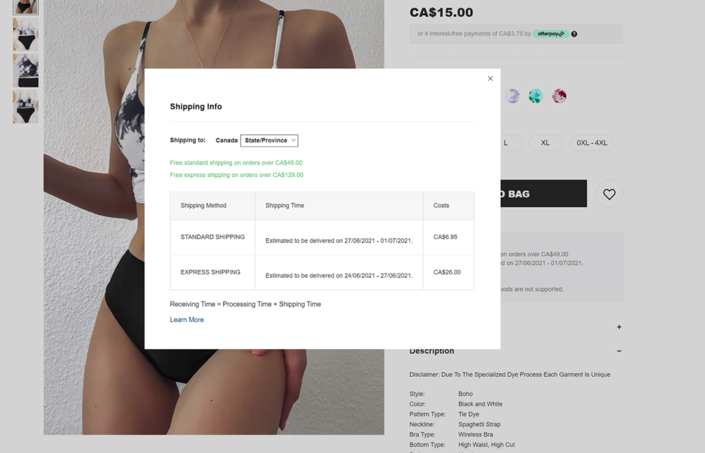
- Shipping details and Return policy – Communicate the most important information right at front. For example, if your eCommerce website detects the location of a user, why not show an estimated delivery date if the item is purchased today? Additionally, to keep the user on the product page and not disrupt their experience, you can show other shipping details and return policy information via a lightbox as depicted below.
Optimizing Your Confirmation Pages
Once a user purchases a product from your eCommerce site, other opportunities are presented. Firstly, I recommend personalizing the confirmation page as much as you can. For example, you use dynamic parameters such as the shopper’s first name in your ‘thank you heading’. This will add a personal touch.
Now to empower your eCommerce confirmation pages you can do the following to optimize them:
On the Confirmation Page
- Encourage shoppers to follow you on your social profiles
- Offer a personal referral code
- Offer a coupon to use on their next purchase
- Inform your customer what they can expect from you next – for example, will they receive an email from you? If so, when and about what?, where can they find their receipt? Etc..
- Show a very short survey of 1-2 questions max. Where you can ask your new customer on the ease of finding the product purchased, and simplicity of buying the product on your site. The answers will help you optimize your eCommerce site’s UX and improve conversion rates.
Confirmation Page Marketing Funnels
- If the shopper clicked on the CTA to follow you on a particular social profile, you can simply follow-up with a ‘thanks for joining us [social platform name]’ via an automated email or SMS.
- If the shopper clicked on their personal referral code, follow-up with them via email about it. For example, you can send them an email that shows the shopper where they can see their commissions and or number of successful referrals.
- In your confirmation of purchase email, not only send the shopper their receipt but also, share: how you will keep them informed of their product’s shipment, remind them to use their coupon on their next purchase, offer them the opportunity to receive your marketing communications, and most importantly if they have any questions let them know how they can contact you.
- Once your shopper receives their product, you can then segment them into a ‘new shopper coupon’ automation. Where, after a couple of weeks or so, an email or SMS will be sent to the customer to remind them to use their coupon code on their next purchase. If the customer does not engage, on their next site visit, you can still deploy an automated message about their coupon code.
- Until the customer’s next site visit and if the customer opted into your marketing database, you can deploy a drip campaign that sends the customer an email about new arrivals which they can add to their ‘wishlist’.
Other eCommerce UX fundamentals include:
- Social Proof – Add testimonials, product reviews, and user-generated content to product pages and anywhere else that deems appropriate.
- Fast and Easy Communication – Such as FAQs, CTAs to speak with a product specialist, terms and conditions summaries on product pages or checkout pages, summaries of your return or refund policy on product pages or checkout pages.
- Hassle-Free Transaction and Checkout Flow – Such as adding registered customers, creating an account, and guest options, and try reducing the number of stages or clicks required to actually purchase an item.
- Highlighting your eCommerce Site’s Security – Displaying your security badges in a prominent place on your site is an effective way to signal to your shoppers that you take their safety seriously. You may also want to write a clear security policy that’s easy for customers to find.
- Mobile Shopping – This can really be it’s own blog post; but to mention some of the must haves your eCommerce mobile experience should allow shoppers to:
- Zoom on product images
- Add double-tap gestures
- Optimize your forms for mobile
- Take advantage of mobile devices GPS
- Customize the search experience
- Use voice-recognition for searches
- Easy thumb-oriented interactions so spacing of elements is key
- Offer multiple types of payment methods such a Apple Pay and Google Pay
Next, I will be creating a post about Marketing Best Practices for eCommerce.
If you have additional eCommerce UX fundamentals to add, please share them in the comments. Thank you.